What is a Pareto Chart? Definition and Example.
|

What is a Pareto Chart? Definition and Example.

It can be challenging for you to understand the main problems and their causes, instead, you spend your time on solving problems with the least influence on the project.

In such situations, the Pareto Chart can help solve problems. The Pareto Chart is one of the seven basic tools of quality management. The Pareto Diagram can help you segregate the defects and their causes. Once you get this info, you can focus on the cause that is generating the most issue.

This is an important tool in quality management and project managers use it to find problems with the highest influence.

Validated Deliverables Versus Accepted Deliverables
| | |

Validated Deliverables Versus Accepted Deliverables

This blog post was written based on the fourth edition of the PMBOK Guide. Since the arrival of the PMBOK Guide 5th Edition, this post is no longer valid. However, I am leaving it intact as part of organizational process assets. If you wish to review old definitions you can read them here.

Many PMP aspirants may confuse validated deliverables and accepted deliverables. They seem similar, but they are not.

Validated deliverables and accepted deliverables are important concepts in project management. You will see a few questions on these topics on your PMP exam.

Grade Vs Quality
| | |

Grade Vs Quality

Grade and quality are two of the most commonly used terms in project management. Not just in this field either; you will use these terms on a daily basis. For example, people frequently say that this is a low-grade product, this is a high-grade product, this is a low-quality product, or this is a high-quality product.

What does that actually mean?

Does “low-grade” mean bad or undesirable and “high-grade” always mean good?

To put it simply, no. low-grade and high-grade are not necessarily right or wrong, and that is what we are going to discuss in this blog post.

Grade and quality are fascinating concepts; however, even professionals don’t understand their differences and mistakenly use them synonymously. They are not difficult terms to understand, we simply need to pay them a bit more attention.

Quality Control vs Verify Scope
| |

Quality Control vs Verify Scope

In the PMBOK Guide, fifth edition, the validate scope process has replaced the verify scope process; therefore, this post is obsolete. Please refer to my new blog post on quality control and validate scope.

The quality control and verify scope processes are important for a project as they ensure that the deliverable is defect free and meets the user’s requirements.

Since both processes involve inspection and testing many professionals get confused and think that they are the same. They have different objectives and are carried out with a different goal in mind.

Corrective Action: Definition, Meaning, Template & Examples

Corrective Action: Definition, Meaning, Template & Examples

Definition: Corrective action can be defined as an intentional activity that realigns the performance of the work with the approved plan. In quality management, corrective action is a future response to the defect repair process. This forward-looking next step ensures that the error will not occur again. For example, let’s say you find some defective…

Scatter Diagram (Scatter Plot or Correlation Chart): A Guide with Examples
|

Scatter Diagram (Scatter Plot or Correlation Chart): A Guide with Examples

A scatter diagram is one of the seven basic tools of quality, but many professionals find it to be a difficult concept.

Other charts use lines or bars to show data, while a scatter diagram uses dots. This may be confusing, but it is often easier to understand than lines and bars.

In this blog post, I will explain the scatter diagram.

A scatter plot, scatter graph, and correlation chart are other names for a scatter diagram.

Fishbone Diagram (Cause and Effect, or Ishikawa Diagram): Example and Template
|

Fishbone Diagram (Cause and Effect, or Ishikawa Diagram): Example and Template

The fishbone diagram is one of the seven basic quality control tools. Though all these tools have their importance, the fishbone diagram is distinct.

In Six Sigma, you use it in the “Analyze” phase of DMAIC. DMAIC stands for define, measure, analyze, improve, and control.

This diagram got the name Ishikawa because Japanese professor Kaoru Ishikawa developed it in 1960. Mr. Ishikawa was a famous expert in quality management.

Control Chart Versus Run Chart
|

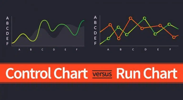
Control Chart Versus Run Chart

In this blog post, we will discuss the control chart and the run chart. This is a request from Umasankar Natarajan, who is a visitor to my blog and asked me to write about the seven basic quality control tools.

Although a run chart is not one of these basic quality control tools, knowing it will help you understand the control chart.

Control charts and run charts are essential tools in quality management that help you identify trends or errors in the product or the process. These charts let you know:

Verification Vs Validation
| | |

Verification Vs Validation

Validation and verification are two important terms in project management; they seem very similar, and it’s easy to get them confused.

These are important concepts and any PMP aspirants needs to understand them well. I will explain these terms fully, so you will have a better understanding of them when you finish this blog post.

This topic is not very important from the PMP exam point of view. However, as a project manager, you must know the difference between these terms.