Project managers have a significant amount of responsibility, one of which is to monitor the progress of their projects. It is more effective to highlight the progress of the project by using a visual representation of the facts on the project.
In today’s world, progress reporting has been mechanized through project management software, task management software, and so on.
Burndown and burnup charts are frequently used in agile methodologies such as scrum, and project managers typically present management with information on the project by utilizing these charts.
In today’s post, we will discuss the burndown chart in Scrum.
What Is a Burndown Chart?
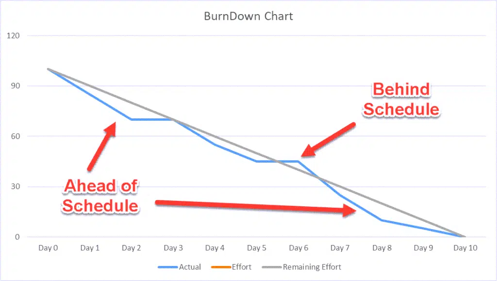
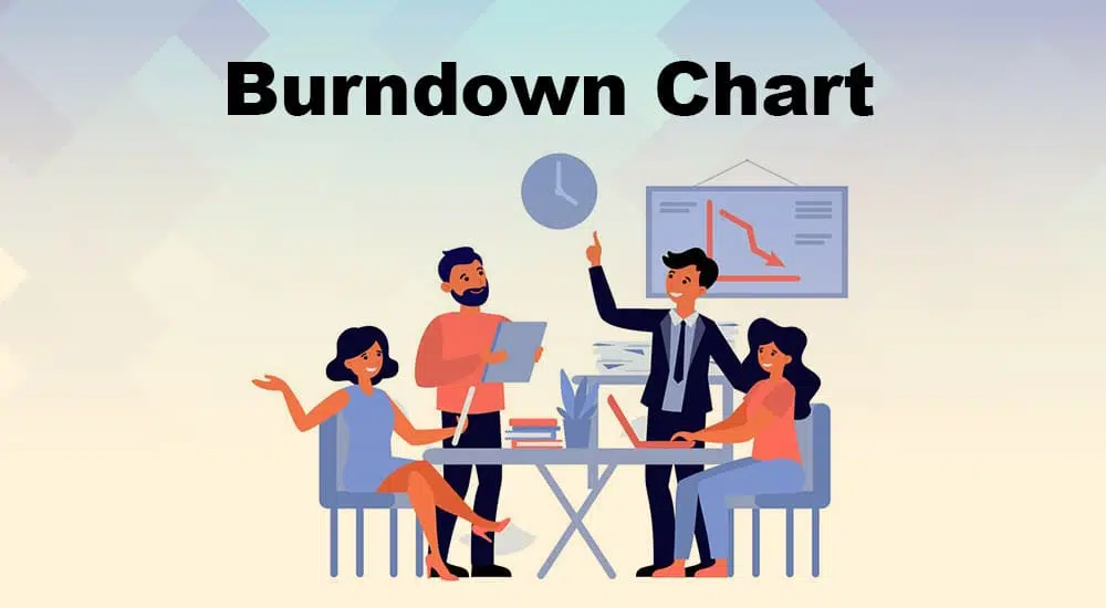
A burndown chart is a tool used in project management that provides a visual representation of the progress being made on a project. It shows the remaining work against time on a graph.
The work done on the left is expressed along the vertical axis, while the chronology is shown along the horizontal axis.
Charting a user story graph against time summarizes the overall effort and how quickly a team works. The beginning of the project may be found on the extreme right, and its completion can be found on the extreme left.
Utilizing this chart, one may more accurately forecast the project’s completion.
Types of a Burndown Chart
- Sprint Burndown Chart: It shows the amount of work left in milestones.
- Product Burndown Chart: It shows the remaining work of an entire project.
How Does a Burndown Chart Work?
Project managers must understand the burndown chart to make the most out of it. A burndown chart works best in agile projects where projects deal with short sprints.
A burndown chart estimates the work and plots it against the time.
Story points, milestones, and sprints represent work on the Y-axis, while time is represented on the X-axis.
How To Read a Burndown Chart?
To read a burndown chart, you have to understand its component. Start from the top left and walk through to the bottom of the right end.
The following aspects are taken into consideration on reading a burndown chart.
- Start Point: This is a point to the top left end.
- End Point: This is a far bottom right endpoint.
- Timeline: It is represented on the X-axis and can be in hours, days, weeks, etc.
- Estimating the Values Left: This shown on the Y-axis represents the work left undone according to the estimates.
- Ideal Work Line: A straight negative slope would show the remaining work under an ideal condition.
- Actual Work Line: Unlike the ideal work line, a negative slope across the graph shows the true picture of the current project’s status. It may not be as straight as the ideal work line since various teams work at different paces.
Measuring Performance
You can measure the project performance as follows:
- When the actual work line is above the ideal work line, more work is left than planned. The project is behind schedule, and optimization is needed.
- When the actual work line is below the ideal work line, more work is completed, and the project is ahead of schedule.
This information helps project managers take corrective and preventive actions on time, if needed, and bring the project on track.
Time Estimation
Thanks to this tool, project managers can now regulate the variation in time estimates.
The precision with which the time estimations were made will determine how closely the actual and planned work lines align.
If a team continuously underestimates the time needed to complete each sprint, the real line will appear below the ideal work line, giving the impression that the team is working more quickly than it is. This is a misleading representation of the situation. When time is overestimated, things go in the opposite direction; as a result, the progress will be behind the originally expected timeline.
Efficiency Factor
An efficiency factor is often included in the burndown chart to correct the challenges mentioned in the previous point. After the first iteration, review the chart and recalculate it for a better estimation for the next iteration.
This step in reading a burndown chart can be automated to spontaneously calculate the project’s efficiency at every stage and adjust to areas with inaccurate estimations.
How To Create a Burndown Chart
The following is a stepwise approach to creating a burndown chart.
1. Collect and Analyze Data
Capture the necessary information to create the burndown chart.
2. Estimate Needed Effort
Create an estimate of the amount of work necessary to meet each project milestone. Taking into account the perfect baseline allows for the calculation of this estimate.
To execute a project that has ten milestones, for instance, an ideal baseline of ten days is created. This indicates that it will be optimal to complete one milestone per day to finish the project on schedule.
3. Setup a Progress Baseline
This helps compare the planned and actual work done as it shows the planned progress and completed work against the time. Also, at this point, a gap analysis can be done.
4. Monitor Actual Progress
After estimation, daily progress shows the time spent completing a sprint. As in the example stated above, all project milestones must be completed after ten days.
5. Input Work Fields to the Sheet and Plot the Burndown Chart
This step depends on the tool used to create the burndown chart. For example, if ms-excel is used, the following steps are followed.
Open a new spreadsheet.
- Add details to the rows and columns.
- Highlight the fields to be included on the work line graphs
- Click on insert chart and select the appropriate line graph
- Properly label the chart.
The actual work line may not be as accurate as the ideal one. Some deviations will be there as the project progresses.
Burndown Chart Example
Duration: 10 days
Sprint Backlog: 10 tasks
Velocity: 100 hours
100 hours over ten days equates to 10 hours daily. To create the burndown chart, the data should get captured daily. The total starts with 100 hours, then 90 hours left 1 (100 – 10) at the end of the day, 80 hours left at the end of day 2, etc.

The daily planned progress is recorded in the below table.
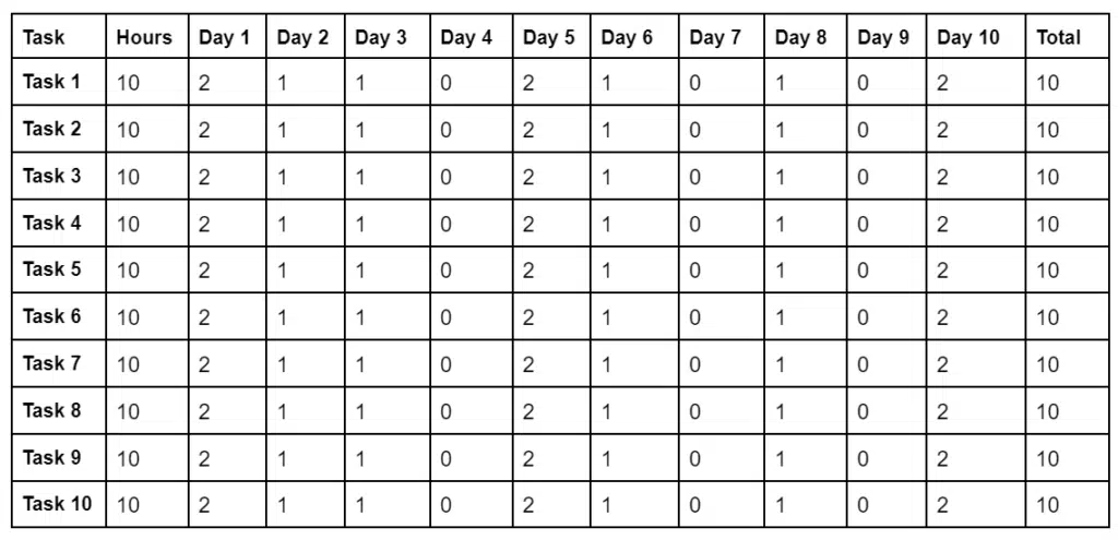
The remaining effort is captured at the end of the day. The effort caught is the total (sum) of the calculated or estimated time remaining at the end of each day.

Plotting BurnDown Chart
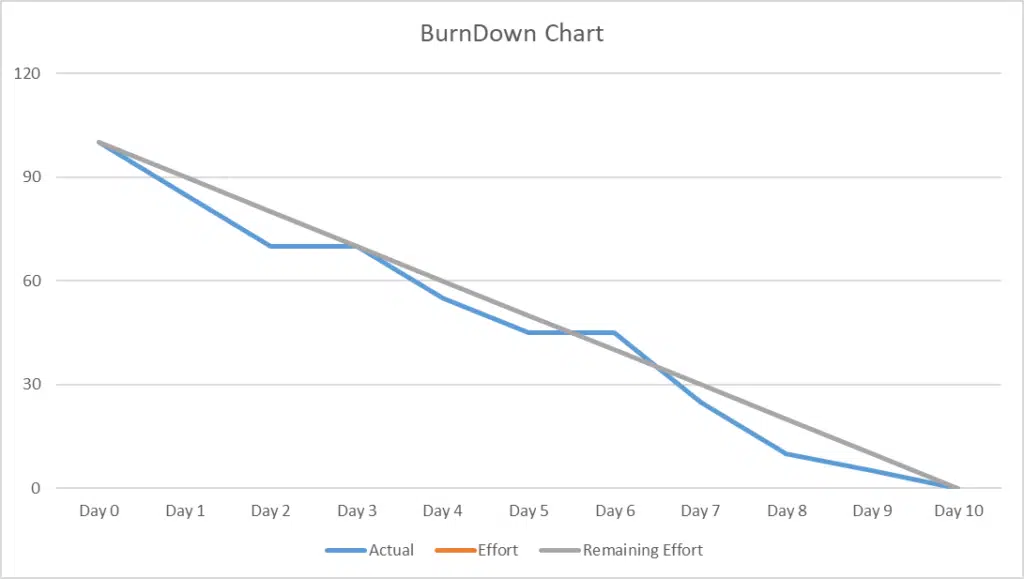
- The X-axis represents time in hours.
- The team has 10 days and 100 hours to complete the task.
- Y-axis represents the days.
- This graph is applicable in an ideal situation where a team follows the plan and completes the tasks within the given time.
- On the graph, on Day1, all tasks are pending; this marks the starting point.
- The team could not meet up with the stipulated line graph, then started as a flat horizontal plane and burned downward towards 0.
- Burning down a chart means arranging events on the chart from total tasks expected, i.e., 100% to its full completion.
The Benefits Of Using a Burndown Chart
Burndown chart is useful and effective for agile projects in the following ways:
1. Status Report
The most important advantage of using a burndown chart is that it allows you to monitor and measure progress while also displaying the balance of effort.
It demonstrates the speed at which the project is moving, which refers to the estimations of the total efforts associated with user stories that have been finished during an iteration.
2. Early Detection of Roadblocks and Obstacles.
The burndown chart is used to determine whether or not a project is running behind schedule and to identify any problems that may impede further development.
During the daily Scrum stand-up meetings, the project team uses a burndown graph to understand better how they are required to carry out their duties, as the chart points out specific areas that require attention. With this, timely interventions can be made before they evolve into bigger unsolvable problems.
3. Motivates and Improves Team Performance
By comparing project performance against an ideal baseline, this pictorial representation of the progress keeps all team members on the same page.
The chart encourages the team to do better by providing necessary information for future sprint planning meetings.
It helps the reallocation of resources and tasks to enhance efficiency.
4. Simple, Easy to Create, and Understand
Detailed Scrum designs can be complex and difficult to understand; a burndown chart takes out this complexity and carries all team members along.
They are easy to create and encourage effortless monitoring of the project’s story and the velocity it is moving.
Challenges of a Burndown Chart
A burndown chart has the following challenges:
1. Lack of Adequate Details to Detect Scope Creep
A burndown chart only provides a summary and does not consider important information, like how the product backlog has evolved.
It can be difficult for project managers to determine if changes on a chart result from modifications to the project scope or the accomplishment of milestones.
This issue can be handled by incorporating a separate line in the chart showing the overall size of the backlog.
2. High Dependency on Progress Baseline
When creating a burndown chart, the accuracy of the ideal work baseline is important. Because this will determine whether the actual work line will appear above or below the ideal, leading to chart misreading.
A solution is to include an efficiency factor in the recalculated chart after each iteration to ensure accuracy.
3. Does not Consider What’s Next
A challenge with using a burndown chart is that everyone seems focused on getting to point zero. This places the mind of team members on race mode, thereby forgetting to factor in plans for future sprints.
Burndown Chart Vs. Burnup Chart
Several similarities and differences exist between a burndown and a burnup chart.
Similarities between Burndown Chart and Burnup Chart
- Both charts have similar components and are both graphical.
- Both charts can be created manually on paper or in an automated spreadsheet.
- Both charts are used for project monitoring.
- Both charts show efforts for Agile and Scrum-based products.
- Both charts are simple and easily understandable.
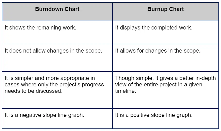
Difference between Burndown and Burnup Chart
Conclusion
A burndown chart is a graphical representation of the progress made on a project. It is an effective tool for the project manager to communicate with stakeholders. It is simple to design, adhere to, and assist the project team in monitoring and controlling the progress of the project.

I am Mohammad Fahad Usmani, B.E. PMP, PMI-RMP. I have been blogging on project management topics since 2011. To date, thousands of professionals have passed the PMP exam using my resources.

