Project managers should not ignore the uncertainty; instead, they should analyze and understand them better as part of risk management for a robust decision-making process.
In the initial phase, uncertainty is high due to the limited availability of information. However, as the project progresses, the situation becomes clear, and project planning improves through progressive elaboration.
Forecasting plays a key role in project planning, and a tornado diagram helps improve the confidence level in project forecasting.
A tornado diagram is a simple tool to determine the confidence level of a forecast. This forecasting technique lets you visualize the impact of uncertainties, such as how a change in one variable affects the output variable.
The outcomes are sorted from the largest to the smallest. Because of limited resources, a project cannot address all risks. Hence, you rank them and focus resources on addressing variables with significant impact.
What is a Tornado Diagram?
A tornado diagram is a risk mapping tool similar to a bar chart. It helps carry out sensitivity analysis for comparing the relative importance of variables.
Since the shape of this chart looks like a tornado, this diagram is known as a tornado diagram.
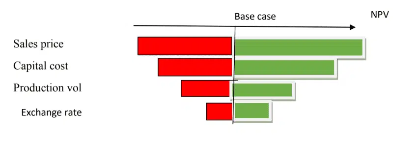
A tornado diagram is a sensitivity analysis tool that allows you to study how uncertainty in the output of a mathematical model can be distributed among input variables. Other sensitivity analysis tools include spider diagrams, correlations, critical indexes, probability Gantt charts, and schedule impact indicators.
A project has many variables, and you must know the impact of a variable on the outcome. The concerned outcome can be cost, project duration, or quality. You should know how sensitive the output is to a particular variable and know how to prioritize it.
To analyze the impact of a value, only one input variable is considered at a time while keeping others at the baseline.
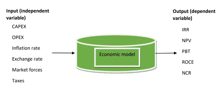
After drawing the diagram, you can see which variable has the greatest impact on the outcome. Some of the outcomes you can review include economic indices such as Internal Rate of Return (IRR), Net Present Value (NPV), Return on Capital Employed (ROCE), and Net Cash Return (NCR).
How to Create a Tornado Diagram
Step 1: Formulate the Model
Here, you use a deterministic model, i.e., a formula against a statistical one called stochastic. Project models can be economical, schedule, quality, cost, etc.
For example, you may want to analyze a high NPV or IRR project, schedule, etc.
These desired outcomes depend on several variables. Therefore, you will need to analyze them individually to find which variable affects the outcome most.
This helps develop mitigation plans.
Step 2: Assess the Range
For each variable, assign a reasonable range of values. Examples include:
Worst case – lowest value/downside
Base case – baseline value/most likely
Best/optimistic case – highest value/upside
The range should be modestly advisable +/- 10%.
The variable should not exceed the range set. Here, experience and expert judgment help set the appropriate worst-case, best-case, and baseline values.
Step 3: Select the Value Metric
Select the value metric of the selected outcome. Let’s say NPV, for this illustration.
Step 4: Calculate the Range for the Value Metric
This is the highest and lowest value.
Here, you tweak one variable while keeping other variables at baseline and examine the impact on the NPV. Record the outcomes for upside and downside, and then tabulate.
A typical case where you would study three input variables is the exchange rate, CAPEX, and sales volume.
Note that these inputs have uncertainties, and you are examining which fluctuations (uncertainty) will influence the NPV most.

Step 5: Plot the Tornado Chart
Using MS Excel, plot the bar chart for the upside and downside, then rank it; it will look like a tornado.
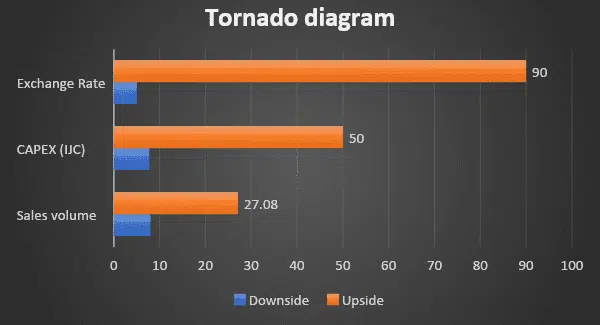
The diagram shows how sensitive the NPV is to each variable. You can see that the exchange rate is the most impactful variable. You can now develop a risk response plan to manage this variable.
Relationship between Tornado Diagram, Monte Carlo Simulation, and Decision Tree
These are all diagrammatic decision-making tools; however, tornado diagrams consider the effect of one variable on the output and do not involve probability. Monte Carlo Simulation and Decision Tree use probabilistic distribution or stochastic approach.

Benefits of Tornado Diagram
- It helps optimize resource utilization.
- It helps you find the relative importance of each variable.
- A quick view shows you the most impacting variable.
Limitations of Tornado Diagram
- It treats one variable at a time, which may not align with practical situations as these variables are interconnected. A variable may behave differently when studied alone than when combined with others.
Summary
A tornado diagram is a great tool for analyzing the impact of a variable on the desired outcome. Project managers can study it, make better decisions, and invest resources in variables that matter most.

I am Mohammad Fahad Usmani, B.E. PMP, PMI-RMP. I have been blogging on project management topics since 2011. To date, thousands of professionals have passed the PMP exam using my resources.

