Have you ever looked at a project timeline and wondered where most delays occur? Understanding the distribution of data is a key skill for project managers, and histograms help interpret it. As a statistical tool, a histogram represents a frequency distribution using adjacent rectangles, with widths corresponding to data intervals and areas proportional to the frequencies.
A histogram is more than a simple bar graph; by showing the shape, dispersion, and central tendency of a dataset, a histogram reveals patterns that spreadsheets hide. The Project Management Professional (PMP) exam tests your ability to interpret such charts because quality management relies on data.
Histograms are among the seven basic quality tools defined by quality pioneer Kaoru Ishikawa and are a vital skill for anyone pursuing the PMP credential.
This blog post explains what histograms are, why they matter, how to build and interpret them, and how mastery of histograms can boost your exam performance.
Let’s get started.
What is a Histogram in Project Management?
A histogram is a special type of bar chart used to describe the dispersion, central tendency, and shape of statistical distributions. It takes raw numbers and groups them into intervals (bins) on the horizontal axis. The height and area of each bar correspond to how many observations fall within each interval. Histograms make it easy to spot whether data follow a bell curve, are skewed, or show multiple peaks.

Unlike bar charts, which often display categorical data with gaps between the bars, histogram bars touch one another because the underlying data are continuous.
Histograms are not new. The English mathematician and biostatistician Karl Pearson popularized the term “histogram” in the late nineteenth century, though the technique had existed earlier. Today, histograms are widely used in statistics, quality control, finance, and project management.
The Project Management Institute’s A Guide to the Project Management Body of Knowledge (PMBOK Guide) lists histograms among the seven basic quality tools, alongside cause-and-effect diagrams, check sheets, control charts, flowcharts, Pareto charts, and scatter diagrams. If you are preparing for the PMP exam, recognizing these tools is essential.
Why Histograms Matter in Project Management
Histograms translate numerical data into visual stories. In project management, they help you determine whether a process meets customer requirements, compare outputs from suppliers, identify changes over time, and decide whether different processes produce similar results. Histograms allow project managers to monitor profitability, analyze process intensity, and determine which aspects of a project require further improvement.
When you plot project data—such as task durations, defect counts, or resource utilization—you can quickly see which values are common and which are outliers. Such insights support fact-based decision-making.
Histograms also play a role in resource management. A resource histogram is a bar chart that shows the number of hours or resources allocated to a task over time. By visualizing workload peaks and valleys, you can smooth assignments, avoid burnout, and negotiate with stakeholders. PMP exam questions often ask you to distinguish between a resource histogram and a general histogram, or to interpret a resource histogram in a scenario. Practicing these interpretations builds confidence for the exam and improves everyday management.
Seven Quality Tools at a Glance
To see where histograms fit within the suite of quality tools, refer to the infographic below. It summarizes the seven basic quality tools that every PMP candidate should know and places the histogram among them.

Alt text: Infographic summarizing the seven basic quality tools—cause and effect diagram, check sheet, control chart, flow chart, histogram, Pareto chart, and scatter diagram—on a light background with a blue header.
Each tool has its purpose. For instance, a cause-and-effect diagram (also known as a fishbone diagram) helps identify root causes, whereas a Pareto chart prioritizes issues by frequency. Histograms serve as the workhorse for understanding distributions. Mastering all seven tools ensures you can select the right one for the job.
Histograms Vs Bar Charts and Pareto Charts
Histograms, bar charts, and Pareto charts are standard tools for analyzing project data, but each serves a different purpose. A histogram shows how data is distributed across ranges, helping project managers see variation and patterns. A bar chart compares values across separate categories, making it useful for simple comparisons. A Pareto chart ranks problems from most to least frequent and includes a cumulative line, helping teams focus on the few causes that create most issues.
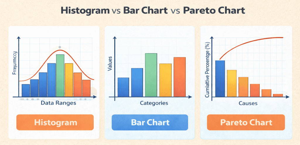
In project management, histograms analyze process performance, bar charts compare results, and Pareto charts support quality improvement decisions.
The following table summarizes the key differences between histograms, bar charts, and Pareto charts.
| Parameter | Histogram | Bar Chart | Pareto Chart |
| Purpose | Shows how data is distributed over ranges | Compares values across categories | Identifies the most important causes among many |
| Type of Data | Continuous data (ranges or intervals) | Categorical or discrete data | Categorical data, ordered by importance |
| Bar Order | Bars are in a fixed order based on data ranges | Bars can be in any order | Bars are sorted from highest to lowest |
| Gaps Between Bars | No gaps (bars touch each other) | Gaps between bars | Bars touch, like a histogram |
| Focus | Variability, spread, and shape of data | Comparison between categories | Prioritization using the 80/20 principle |
| Common Example | Defect size ranges, task duration ranges | Number of defects by type | Defects ranked by frequency |
| Additional Elements | May include a normal distribution curve | No cumulative line | Includes a cumulative percentage line |
| Use in Project Management | Analyze process variation and performance | Compare teams, resources, or outputs | Identify root causes needing urgent action |
| PMP Exam Relevance | Quality management and data analysis | Basic data comparison tool | Quality improvement and root cause analysis |
Key Takeaway:
- Use a histogram when you want to understand data distribution and variability.
- Use a bar chart when you want to compare categories.
- Use a Pareto chart when you need to focus on the few causes creating most problems.
Building and Interpreting Histograms for Your PMP Exam
Creating a histogram involves a few straightforward steps:
- Collect Data: Gather measurements related to your project. Examples include defect counts per day, task durations, or customer wait times.
- Choose Appropriate Bins: Divide the data range into equal-width intervals. Too few bins may hide patterns; too many may create noise.
- Count Observations: For each interval, count how many observations fall within it.
- Draw the Bars: On graph paper or in software, draw adjacent rectangles for each bin. The height of each bar equals the count for that interval.
- Interpret the Shape: Look for clusters, gaps, and outliers. A symmetric, bell-shaped distribution suggests a normal distribution; a skewed distribution indicates bias or constraints.
For example, imagine you want to analyze support ticket resolution times. You collect 20 data points: some tickets are resolved within an hour, most take between 2 and 4 hours, and a few take up to 6 hours. By grouping these times into one-hour bins and plotting them, you notice that the majority cluster between two and four hours. You might ask: Can process improvements shift the distribution toward shorter times? Interpreting the histogram helps answer that question.
Suppose you’re preparing for the PMP exam, practice drawing and reading histograms. The exam may present a resource histogram showing when a team member is overloaded or underutilized. You may be asked to adjust the schedule to level resources or to identify the next step upon observing a skewed distribution. Familiarity with the process will help you respond quickly.
Real-World Examples of Histograms in Project Management
Histograms come to life when paired with practical scenarios. Here are two situations illustrating their value:
Quality control in manufacturing. A project team developing a consumer electronics device monitors the thickness of a component. Measurements are taken on 100 units. After plotting a histogram, the team sees a slight skew toward thinner parts. The shape indicates that the production process drifts toward the lower limit. The team investigates and discovers that a machine calibration issue caused the shift. After correcting the calibration, the distribution centers on the target specification.
Resource planning for software development. During a sprint, a manager logs the hours spent by each developer on testing tasks. Most developers spend between eight and twelve hours, but a few spend only two hours. When the data are plotted as a histogram, it becomes clear that one or two team members were reassigned to urgent bug fixes outside the sprint’s scope. The manager uses the insight to redistribute tasks and communicate workload expectations in the next planning meeting.
FAQs
Q1. What is the purpose of a histogram in project management?
A histogram displays the frequency distribution of values in continuous data, helping managers identify patterns and variability. It assists in determining whether processes meet quality targets.
Q2. How is a histogram different from a Pareto chart?
A histogram groups continuous data into adjacent intervals, while a Pareto chart sorts categories from highest to lowest and shows cumulative percentages for prioritization.
Q3. Do I need advanced statistics to use histograms?
No. Creating a histogram requires counting the number of observations in each interval and drawing rectangles to represent those counts.
Q4. Why do histograms appear on the PMP exam?
The PMP exam tests knowledge of quality tools. Histograms are among the seven basic tools, so you must understand when and how to apply them in project scenarios.
Q5. How does understanding histograms improve my career?
Mastery of histograms supports data-driven decision making. As more professionals pursue PMI credentials, demonstrating practical analytic skills helps you stand out in a competitive job market.
Summary
Histograms may seem like simple charts, but they can transform raw data into actionable insights. By grouping data into intervals, they reveal patterns that inform quality control, resource management, and process improvement. For PMP candidates, understanding histograms is essential because they appear in exam questions and reflect core project management concepts. Beyond the exam, histograms will help you lead projects with confidence by making complex data accessible to your team and stakeholders.
Further Reading:

I am Mohammad Fahad Usmani, B.E. PMP, PMI-RMP. I have been blogging on project management topics since 2011. To date, thousands of professionals have passed the PMP exam using my resources.