A scatter diagram, one of the seven basic quality tools, is often challenging for many professionals to understand.
This diagram, also known as a scatter plot, scatter graph, or correlation chart, presents data as dots instead of lines or bars. While it may seem confusing initially, this visualization method can be more intuitive once understood.
The scatter diagram was first introduced in 1833 by English scientist John Frederick W. Herschel in his study of Orbits of Double Stars. Later, in 1886, it gained broader recognition thanks to Francis Galton, a Victorian-era polymath who popularized it and introduced the statistical concept of correlation.
In this blog post, I will explain the scatter diagram, how it works, give a real-world example, and discuss its types and its pros and cons.
What is a Scatter Diagram?
A scatter diagram is a simple chart showing the relationship between two data sets. The first set of data or variables is independent, and the second depends on the first. It uses dots to represent individual data points, with one variable plotted on the x-axis (i.e., horizontal) and the other on the y-axis (i.e., vertical). By looking at the pattern of dots, you can see whether there is a connection or trend between the two variables.
For example, as one value increases, the other may also increase or decrease. Scatter diagrams are useful for spotting trends, patterns, and possible relationships between variables.
The PMBOK Guide defines the scatter diagram as follows: “A scatter diagram is a graph that shows the relationship between two variables. Scatter diagrams can show a relationship between elements of a process, environment, or activity on one axis and a quality defect on the other axis.”
A Real-World Example of a Scatter Diagram
You are analyzing accident patterns on a highway and choose two variables: vehicle speed and the number of accidents. After plotting these on a scatter diagram, you notice that as vehicle speed increases, the number of accidents also rises, revealing a correlation between the two.
Normally, the independent variable is plotted on the x-axis (horizontal), and the dependent variable is on the y-axis (vertical). The independent variable controls the behavior of the dependent one. However, you can also plot a diagram using two independent variables and assign either to any axis.
Although some professionals compare scatter diagrams to fishbone (Ishikawa) diagrams, they differ. A fishbone diagram shows cause and effect but doesn’t reveal their relationship, whereas a scatter diagram can help you analyze the correlation between variables. You can use a fishbone diagram to identify cause-and-effect variables and then apply a scatter diagram to study their relationship closer.
How to Interpret Scatter Plots
Interpreting scatter plots is necessary for understanding the relationship between the variables.
Here is how to analyze a scatter plot and identify the correlation:
1. Understanding the Axes
- X-Axis: Represents the independent variable (i.e., predictor).
- Y-Axis: Represents the dependent variable (i.e., outcome).
2. Identifying Patterns
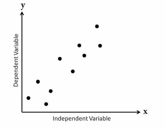
Positive Correlation
- Description: As one variable increases, the other variable also increases.
- Visual Cue: Data points tend to slope upwards from left to right.
- Example: Height vs. weight; generally, taller individuals weigh more.
Negative Correlation
- Description: As one variable increases, the other variable decreases.
- Visual Cue: Data points tend to slope downwards from left to right.
- Example: The relationship between the number of hours spent studying and the number of errors on a test; more study hours often lead to fewer errors.
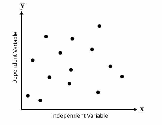
No Correlation
- Description: Changes in one variable do not relate to changes in the other.
- Visual Cue: Data points are scattered randomly, without any discernible pattern or trend.
- Example: There is no logical connection between shoe size and intelligence.
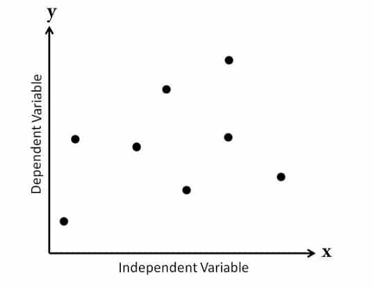
3. Assessing the Correlation Strength
- Strong Correlation: Points are closely packed along a clear line (e.g., upward for positive, downward for negative).
- Moderate Correlation: Points are somewhat clustered around a line but have more scatter.
- Weak Correlation: Points are widely dispersed and do not form a clear line.
4. Identifying Outliers
- Description: Points that lie far from the general trend of the rest of the data.
- Visual Cue: Look for points that stand apart from the cluster of other points.
- Impact: Outliers can significantly affect any analysis’s correlation and results.
5. Drawing Conclusions
- Once you have identified the correlation’s type and strength, you can make informed conclusions about the relationship between the two variables.
- Remember that correlation does not imply causation; further analysis may be needed to establish a cause-and-effect relationship.
Types of Scatter Diagrams
Scatter diagrams can be classified in various ways. I will focus on the two most common classifications used across industries: those based on correlation and those based on the slope of the trend. These are the most widely recognized and applied methods.
Based on correlation, scatter diagrams can be divided into the following three types:
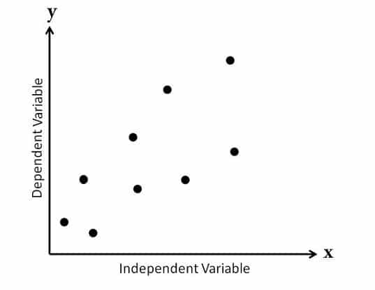
1. No Correlation
Also called a “Scatter Diagram with Zero Degree of Correlation,” this diagram shows data points spread so randomly that no clear line can be drawn through them. As a result, you can conclude that there is no relationship between the variables.
2. Moderate Correlation
Known as a “Scatter Diagram with a Low Degree of Correlation,” this plot shows data points that are somewhat closer together. A relationship between the variables is visible but not very strong.
3. Strong Correlation
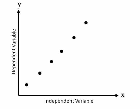
In this case, you conclude that these variables are closely related.
Referred to as a “Scatter Diagram with a High Degree of Correlation,” this diagram has tightly clustered data points. You can easily draw a line following their pattern, thus indicating a strong relationship between the variables.
You can categorize scatter diagrams into five types based on the slope of the data points:
1. Strong Positive Correlation
This shows a clear upward trend from left to right, also known as a “Scatter Diagram with a Positive Slant.” As the value of X increases, the value of Y also increases, thus forming a pattern that resembles a straight line.
Example: As temperature increases, cold drink sales rise.
2. Weak Positive Correlation
Y increases as X increases, but the data points are more scattered, thus displaying a weaker, less consistent relationship between the variables.
Example: As the advertising budget increases, sales increase slightly.
3. Strong Negative Correlation
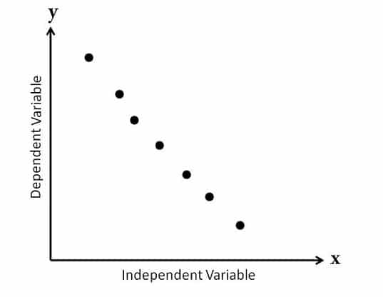
This diagram shows a clear downward trend from left to right, called a “Scatter Diagram with a Negative Slant.” Here, the value of Y decreases as the value of X increases, and the data points follow a straight line.
Example: As temperature rises, winter coat sales fall.
4. Weak Negative Correlation
In this case, as X increases, Y decreases, but the relationship is less distinct, and the pattern is harder to follow.
Example: As work hours increase, productivity decreases slightly.
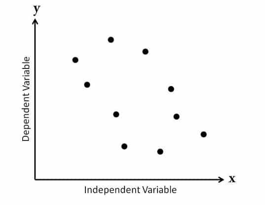
5. No Correlation
There is no visible relationship between the two variables. The data points may be scattered randomly or form a flat line, indicating that changes in the independent variable do not affect the dependent variable.
Example: Shoe size and intelligence have no relationship.
When to Use Scatter Diagrams
You can use scatter diagrams in the following cases:
- Analyzing Relationships: This is when you want to explore the relationship between two continuous numerical variables (e.g., height and weight, sales, and advertising spending).
- Identifying Correlations: This is to determine if a correlation exists (e.g., positive, negative, or none) between the two variables, which can help you measure their interdependence.
- Outlier Detection: This is when you need to identify outliers or anomalies in your data set that could affect the analysis results.
- Regression Analysis: A regression analysis is a preliminary step in which data points are visualized, and the relationship’s linearity is assessed before a regression model is fitted.
- Trend Analysis: This is wo observe trends or patterns in your data over time or changes in data metrics across different periods.
- Comparative Analysis: When comparing two sets of data or groups, you must analyze how the relationship between variables differs.
- Quality Control: In quality control processes, scatter diagrams can visualize the relationship between variables that may affect product quality (e.g., the relationship between temperature and product strength).
Scatter Diagram Advantages
- Provides Visual Representation: Scatter diagrams represent the relationship between two variables, thus making it easier to identify patterns, trends, and correlations.
- Identifies Relationships: Scatter diagrams can help you identify the type of relationship (e.g., positive, negative, or no correlation) between the variables, as well as its strength.
- Detects Outliers: Scatter plots can easily highlight outliers, which can be necessary for data analysis and interpretation.
- Easy to Create: Creating a scatter diagram is straightforward and can be done with essential software tools—or even by hand.
- Uses Multiple Data Sets: Scatter diagrams can compare multiple data sets on the same graph, thus allowing for easy relationship comparison across different groups.
Diagram Disadvantages
- Limited to Two Variables: Scatter diagrams only represent the relationship between two variables at a time, which can be limiting if there are multiple variables of interest.
- Inconclusive: While scatter diagrams can show correlation, they do not imply causation. Further analysis is needed to establish any causal relationships.
- Data Overlap: In large data sets, points may overlap, thus making it difficult to see the actual distribution and relationships between the variables.
- Interpretation Challenges: Scatter diagrams can be misinterpreted without proper labeling and context, thus leading to incorrect conclusions.
- Scale Sensitivity: Scatter plot interpretation can vary depending on the scale of the axes used, which may lead to misleading data representations.
Summary
Scatter diagrams identify the relationship between two variables, which can be between two causes or a cause and its effect. This relationship may be positive, negative, or show no correlation at all.
The first variable is independent, while the second is dependent on it. To observe the relationship, you adjust the independent variable and track how the dependent one responds. In some cases, a scatter diagram can also include two independent variables.
Further Readings:
- What are the Seven Basic Quality Tools?
- What is a Pareto Chart?
- What is a Fishbone Diagram?
- The 5 Whys Approach for Root-Cause Analysis
References:
This topic is important from a PMP exam point of view.

I am Mohammad Fahad Usmani, B.E. PMP, PMI-RMP. I have been blogging on project management topics since 2011. To date, thousands of professionals have passed the PMP exam using my resources.


Why is it difficult to use qualitative attributes in a scatter plot?
Our professor ask as to use scatter diagram to see the relation for example the total development cost and the annual produce but the data will plot is only one from each so how can we see the relation. I hope you can help us.
Thanks Fahad
You are welcome Ali.
A scatter diagram can have two independent variables (as per the summary mentioned above) – How that is possible? It should have one independent variable & one dependent variable know?
In some cases, a scatter diagram can have two independent variables.
This helps me a lot
I am a Geography student and those examples and that limitations and benefits helps me a lot, thanks…
You are welcome Rahul.
Good morning.. Plz say in which book you taken this for reference. I need urgent to claim answer for competitive exams
PMP reference books and internet search.
To much helpful artical and in a very esay language tha would b understandable.
Thanks Imran for your visit.
Well done. Clear and concise with everything needed for a beginner to understand the Scatter Diagram.
Thank you Stephen for your comment.
Thanks for this information; very clear and precise.
Thanks Brian for your comment and visit.
Awesome. Thank you Farhad.
You are welcome Khalilullah.
thanks a lot
You are welcome Junaid.
Easy to understand
Thanks Rahul.
Excellent.
A bit off the topic… I’ve been wondering if there are many opportunities as a project manager , for someone who has been in steel fabrication and welding as their base career? Sorry. I hope this makes sense. Thanks
Thank u so much helped a lot
You are welcome Senumi.
NICE SIR IT IS GREAT ….PLZ SHOW ONE EXAMPLE WITH DATA
Hello Randiv, when I will update the post, I will try to add some chart with data.
what is correlation chart
It is another name of scatter diagram.
Nice Artical
Thanks Pramod.
Greetings Farhad,
Nice and helped topic for PM aspirants and I would also like to add up few more lines.
A scattered diagram is a correlation and they may be positive or negative and are represented by a regression line and are generally used when QC finds variable and that might not be in control and systematic and changing in one another variable.
Independent variable is plotted along the horizontal line axis whereas dependent variable is plotted along the vertical axis.
Thanks & Best Regards
https://tiemchart.com/
Thanks Almesh for sharing your thoughts.
could u pls ……post some solved question related to scatter diagram?
Hello Humna, this time I am too busy with other activities, so cannot fulfil your request. I suggest you refer any good PMP exam reference book to find questions on this article.
very informative ….thank u so much
You are welcome Humna.
good work
Thanks Joran.
Why 2 points lie one on top of other?
A scatter diagram consists of hundreds of diagram, some of them may be at the top of others. You have to see the pattern.
The scatter diagram graphs pairs of numerical data, with one variable on each axis, to look for a relationship between them. If the variables are correlated, the points will fall along a line or curve. The better the correlation, the tighter the points will hug the line.
Thank you it was usefull for me .
You are welcome Hermenegildo.
Thank you’re the best ?
Thanks Arshley for your comment.
Thanks really good explanation.
May you please explain “Decision tree”?
Thanks again
Sure, soon I will write a blog post on it.
Risk Assessment: Here you assess the current risks if they are still valid or can be closed if outdated.
Risk Audit: It deals with effectiveness of risk responses as well as the effectiveness of the risk management process.
Hi
please could you explain what are diffrents between risk audit and risk assessment in control risk .
Thank you
thank you very much. so usefull
You are welcome Mike.
Thanks Fahad. I have been going through all your posts and they are indeed very helpful.
Please keep helping PMP Aspirants like me with your blogs.
Thanks once again!!!
You are welcome Ritika.
I’ve really enjoyed the explanation you made above. Thank you
You are welcome Bilshan.
I didnt understand the exact diff b/w two types of scatter diagrams: type of correlation ans slope of trend coz both the types are showing the same thing. Pls throw some light on my confusion.
Notice the spread of dots. It shows how closely they are related.
Very nice article sir
You are welcome Pradeep.
Very good article and very clear explanation. Really appreciate the effort.
Thanks Raj.
Asalaam-o-alaikum !
The way you explain every topic is marvelous. Thank you.
Could you please explain Resource optimization techniques and Influence diagram.
Okay.
I have noted it, and soon you will see a post on this topic.
Thanks for the good article.
pls note that there’s one typo, it should be “dependent” variable is plotted on the vertical axis (y-axis).
“Usually independent variable is plotted along the horizontal axis (x-axis) and independent variable is plotted on the vertical axis (y-axis) “
Thanks for your comment Vijay.
Error is corrected.
Good article. Thanks a lot.
You are welcome Bijoy.
thank you.. Really i am understood very well .Mnay thanks for you.
You are welcome Muhsin.
The first variable is independent and the second is dependent in the first variable
Correct.
thank you so much.Super
You are welcome Sundarishanmugam.