A burn-up chart is a popular visual diagram used in Agile project management to measure project progress. These Agile charts let you see the completed and remaining work, as well as whether the progress is on schedule.
The Agile burn-up chart shows work progress over time. The chart has two lines: the first shows total project work, and the second shows completed work to date. By comparing the completed work against the planned work, you can see whether your team is performing efficiently. You can see whether the progress is going as planned and when you will complete the project.

Why Should You Use a Burn-Up Chart?
The Gantt chart is widely used for displaying scope completion, featuring a horizontal bar graph where tasks are arranged along a timeline. Each bar’s length represents the duration of a specific task.
Though Gantt charts provide task timelines, they lack the broader context that a burn-up chart offers. A burn-up chart gives stakeholders a clearer view of project progress, as it shows the current status and tracks the project’s scope over time.
With a burn-up chart, stakeholders can easily see completed work and forecast future progress, helping to determine whether key milestones and objectives are being met.
Burn-Up Chart Elements
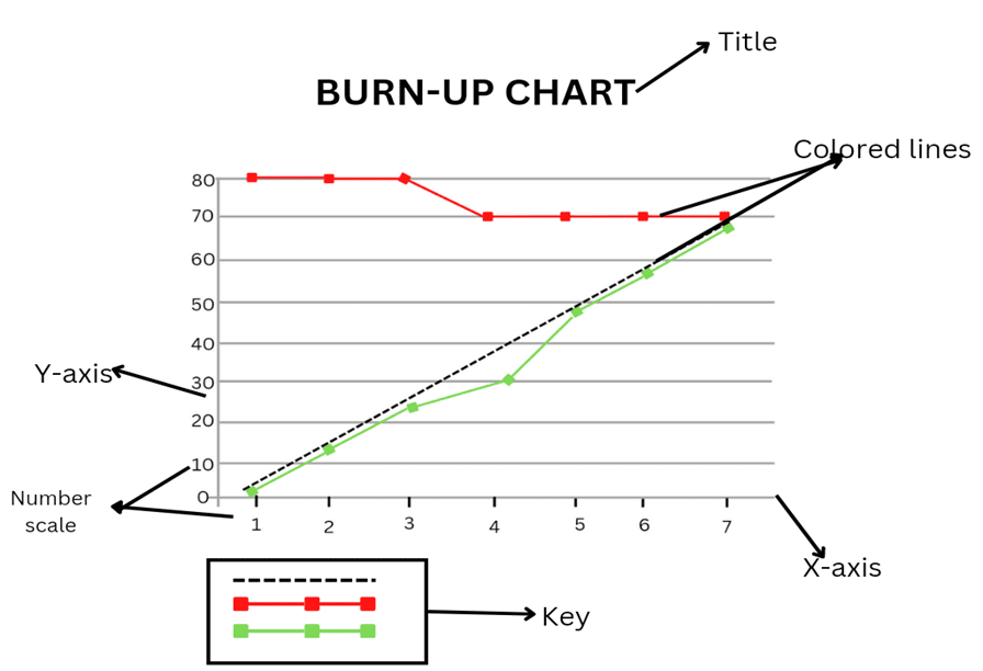
The below image shows the elements of a burn-up chart.
The following are vital features of burn-up charts:
- Title: This explains what the project is about.
- Vertical Line: This is the Y-axis and shows the story points.
- Horizontal Line: This is the X-axis and shows the time needed to complete the project.
- Key: This explains the functions of colored lines in the chart.
- Colored Lines: This shows the number of story points needed to complete a project and the number of already completed points.
- Number Scale: This depicts time on the X-axis and story points on the Y-axis.
How to Read a Burn-Up Chart
Reading a burn-up chart is easy. The chart can have two or three lines, each representing different aspects of the project’s progress.
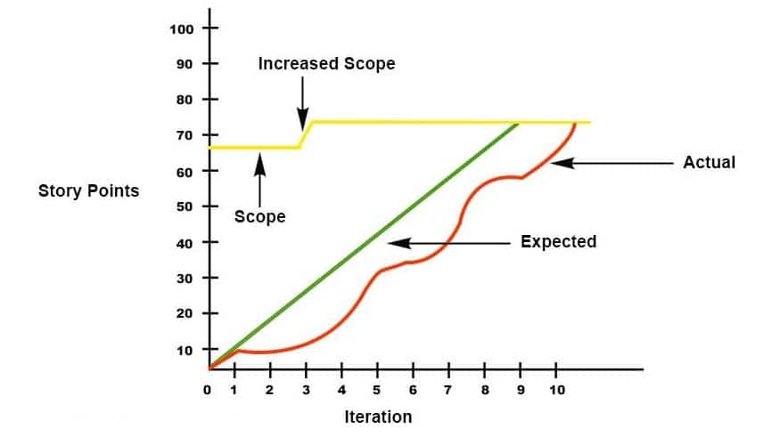
- X-Axis: The X-axis represents the timeline, which could be divided into days, weeks, or months.
- Y-Axis: The Y-axis shows the amount of planned work or story points, reflecting the total work needed to complete the project.
- Yellow Line: The yellow line represents the total number of story points required for project completion. It indicates the project scope. If this line moves, the project’s scope has changed, either due to added or removed tasks. For example, in the case above, new requirements caused an increase in story points.
- Red Line: The red line tracks progress, showing the cumulative number of story points completed over time. For instance, in Iteration 1, the project is on track. However, the team encountered issues between Iterations 2 and 5 and therefore, completed less work than expected.
- Green Line: The green line reflects the estimated progress or planned trajectory. It shows how the project is supposed to unfold over time. Ideally, the red line (i.e., actual progress) should follow or match the green line (i.e., planned progress).
The project is behind schedule if the red line is below the green line. If the red line is above the green line, the project is ahead of schedule. The point at which the green and red lines meet indicates the project’s completion. If they don’t meet, the project is still ongoing.
Step-by-Step Process to Create a Burn-Up Chart
You can follow the following process to create a burn-up chart:
Step 1: Gather Data
You will need two key pieces of data to create a burn-up chart:
- Total Work (Scope): This is the total work to be done, usually represented in story points or tasks.
- Work Completed: This is the cumulative work completed at each point.
Step 2: Set the Timeline (X-Axis)
Decide on the timeline for tracking progress.
This can be divided into:
- Days
- Weeks
- Sprints (if using Agile): The X-axis will represent this timeline.
Step 3: Set the Work Units (Y-Axis)
The Y-axis will represent the amount of work to be done.
Common units include:
- Story points (for Agile teams)
- Tasks or Hours: This will range from 0 (i.e., no work completed) to the total scope of work.
Step 4: Plot the Total Scope Line
Draw a horizontal line on your chart representing the total work or scope to be completed. This is a static line unless the scope changes (e.g., adding new requirements). If the scope changes, adjust this line to reflect the new total work.
Step 5: Plot the Completed Work Line
Track and plot the cumulative work completed regularly (e.g., daily, weekly). The line will gradually rise as more work is done over time. This line should always move upward.
Step 6: Plot the Estimated Progress Line (Optional)
This is the projected trajectory for the project, representing the expected completion rate over time. It helps compare actual progress to the planned timeline.
Step 7: Update the Chart Regularly
Update the completed work line and scope line regularly as the project progresses. This will help monitor how the project is advancing relative to the total scope and forecasted completion.
Step 8: Interpret the Chart
Use the chart to track progress, detect delays, or identify changes in scope. The project is on track if the actual progress line (completed work) follows or exceeds the estimated line. If it falls below, action may be needed to correct delays.
Creating a burn-up chart is easy. You can use spreadsheet software (e.g., Excel or Google Sheets) or project-management tools (e.g., Jira or Trello).
Burn-Up Chart Vs Burn-Down Chart

The burndown and burn up charts help track the project’s progress. Although both charts are useful, they have the following differences:

Burn-up and burn-down charts are simple tools used in project management to track progress, but they show information differently.
A burn-down chart shows how much work is left in the project. The chart has a line that goes down over time. The vertical axis (i.e., Y-axis) shows the amount of work remaining, and the horizontal axis (i.e., X-axis) shows the days or weeks in the project. The line goes down as the team finishes tasks, aiming to reach zero when all work is completed. It can help teams see how much work is left and whether they are on track to finish on time.
A burn-up chart shows how much work has been completed over time. Instead of going down, the line goes up. It has two lines: one for the total work and one for the completed work. This allows teams to see their progress and any changes in the total work, like if more tasks are added.
Key differences between burn-up and burn-down charts are:
- A burn-down chart shows work remaining, while a burn-up chart shows work completed.
- Burn-up charts indicate scope changes, whereas burn-down charts focus on remaining tasks.
- Burn-up charts offer more visibility into progress and scope adjustment, which makes them useful for tracking progress and potential risks.
- Burn-down charts do not show changes in project scope, while burn-up charts do.
- Burn-down charts are negative slope graphs, while burn-up charts are positive.
- Burn-down charts have a single line combining the total and completed work, while burn-up charts have two lines separating the total work from the completed work.
- Burn-down charts are simple to use and understand, and they provide limited project information. Burn-up charts are more detailed than burn-down charts but a little more complicated.
Key Benefits of Using Burn-Up Charts
The key benefits of using a burn-up chart are:
- Clearer Progress Tracking: Burn-up charts show the work completed and the total scope of work, which makes it easy to visualize progress over time, and how much work is left to do.
- Clearer Scope Change Visibility: Unlike burn-down charts, burn-up charts indicate changes in the project scope. The total work line will adjust if new work is added or removed, thus allowing teams to track scope creep or reduction.
- Better Forecasting: Burn-up charts allow teams to predict whether they will finish on time by comparing the work completed (i.e., red line) with the planned trajectory (i.e., green line), thus leading to better project forecasting and scheduling.
- Increased Team Motivation: Burn-up charts can boost morale by showing the progress line steadily rising towards completion, thus providing a sense of achievement as the team sees the tangible results of their efforts.
- More Effective Communication: Burn-up charts provide a clear visual for stakeholders to understand the project’s progress (e.g., any delays or scope changes), which can help you set expectations and facilitate discussions.
- Easier Risk Identification: Since burn-up charts display scope and progress, they can help you identify risks (e.g., scope creep or delays) early, thus allowing for timely adjustments.
Summary
A burn-up chart is a key project-management tool. Its upward-sloping line visually shows the work completed over time. It offers a clear, easy-to-understand way to track project progress, which makes it an excellent communication tool for stakeholders. This chart can help you inform stakeholders how much work has been completed and whether the project is on track.
Project managers can include burn-up charts in performance reports to provide management with a visual summary of progress. By clearly showing completed tasks and changes in scope, it can help with decision-making and ensure transparency throughout the project lifecycle.
Further Readings:
References:
This topic is important from a PMP exam point of view.

I am Mohammad Fahad Usmani, B.E. PMP, PMI-RMP. I have been blogging on project management topics since 2011. To date, thousands of professionals have passed the PMP exam using my resources.