Control charts and run charts are key tools in quality management and process improvement. They help you monitor performance over time. While both charts plot data points in sequence, they serve distinct purposes.
A control chart is used in Statistical Process Control (SPC) and tracks data against predefined control limits to detect process stability and variations. A run chart is a simpler tool that identifies trends and shifts in data without considering control limits.
Control charts are part of seven basic quality, while run charts are not. However, run charts are equally important in quality management as the control charts.
Understanding the differences between these charts can help teams choose the right tool for analyzing process performance and driving continuous improvement.
In today’s post, I will discuss the control chart vs run chart in detail so you will not have a problem using these tools in your processes.
What is a Control Chart?
Control charts help you monitor process stability and consistency over time. They plot data points in a time sequence to show variations and determine whether they fall within acceptable control limits.
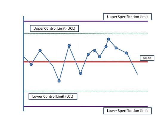
A control chart has a central line representing the process average and upper and lower control limits. The project manager defines the control limits, and data points outside these limits indicate special cause variation, signaling that the process may be out of control. Control charts help maintain quality and improve process performance by identifying trends and patterns.
These charts have specification limits above and below control limits, which the client defines. Any data that falls outside of these limits is a non-conformance.
Control charts display both common cause and special cause variations. Common cause variations are normal and don’t require action, while special cause variations need intervention. Control charts can indicate false special cause variations, wasting time and resources.
Elements of Control Charts
A control chart has three elements:
1. Mean
The mean, or central line, in a control chart represents the average value of the process being monitored. It is a reference point for assessing whether the process is stable or fluctuating. Data points plotted on the chart are measured against this average, allowing teams to identify deviations.
A stable process will have data points distributed evenly around the mean. The mean helps detect shifts in performance, and any significant movement away from this central value may indicate process issues that require investigation.
2. Control Limits
Control limits are the boundaries drawn above and below the mean on a control chart, normally set at ±3 standard deviations from the mean. These limits define the expected range of natural variation in the process. Data points outside the control limits suggest that special cause variation is present, meaning the process may be out of control.
Control limits are not the same as specification limits; they are statistical boundaries that help identify whether the process is stable and predictable.
3. Specification Limits
Specification limits are the customer-defined acceptable range for a product or process. Unlike control limits, which are statistical boundaries defined by the project manager, specification limits are set based on the requirements for performance or quality. They represent the maximum and minimum acceptable values for the process outcome.
If a process consistently stays within the specification limits, it meets customer or product requirements. However, even if a process is within control limits, it may fail to meet specification limits if the average is off target.
Control charts help you find answers to the following:
- Is the process under control?
- Is the project moving in the right direction?
- Are the deliverables within the specification limits?
The Rule of Seven
You may assume that immediate action is required when an observation falls outside the control or specification limits. However, this isn’t always true. Sometimes, you may need to investigate even when all data points are within control limits. One such instance is known as the “Rule of Seven.”
This rule states that if seven or more consecutive data points appear on one side of the mean, an investigation should be initiated, regardless of whether the points are still within control limits. This pattern may indicate an underlying process shift that needs attention.
Types of Control Charts
- c Control Charts: A c control chart monitors the count of non-conforming items in a production process. It helps identify the number of defects in mass-produced items with a constant sample size. This chart is useful for tracking errors or defects in fixed-size batches.
- p Control Charts: p control charts are effective when the sample sizes are unequal. They monitor the proportion of defective units in a sample, making them suitable for processes where the number of units inspected varies over time.
- U Control Charts: U control charts investigate defects per unit when the sample size varies. They focus on the number of defects in each sample and are particularly useful when defects fall outside the upper or lower control limits.
- X-Bar and R Charts: X-Bar and R charts monitor the mean (X-Bar) and range (R) of subgroups. They are best suited for smaller subgroup sizes, five or fewer. The R chart tracks variation within the subgroups, while the X-Bar chart measures the average performance.
- X-Bar and S Charts: X-Bar and S charts are designed for larger subgroups, normally five or more. Instead of the range, these charts use standard deviations (S) to assess variability. They help monitor both the mean and variability, providing insights into the stability of larger sample groups over time.
Example of Control Charts in Real World Scenario
In a manufacturing plant producing electronic components, a control chart monitors the diameter of a critical part. The engineering team collects measurements from samples taken every hour. By plotting these measurements on the control chart, they can visualize process stability.
When data points fall outside the control limits, the team investigates potential causes, such as machine calibration issues, allowing them to take corrective actions and maintain product quality.
Benefits of Control Charts
- Process Monitoring: Control charts help track the performance of a process over time, allowing for early detection of unusual variations or trends before they result in defective outputs.
- Improved Quality Control: Control charts help maintain consistent quality by distinguishing between common-cause and special-cause variations.
- Data-Driven Decisions: Control charts provide objective, real-time data that guide decision-making, reducing reliance on intuition and guesswork in process management.
- Cost Reduction: Detecting process deviations early helps prevent defects and rework, leading to reduced waste, improved efficiency, and lower operational costs.
Limitations of Control Charts
- Requires Statistical Knowledge: Properly interpreting control charts requires an understanding of statistical principles, which may be a barrier for some users without the necessary training.
- Assumes Normality: Control charts often assume that the data follows a normal distribution, which may not always be true in real-world scenarios, leading to inaccurate conclusions.
- Limited to Measurable Data: Control charts can only be used for processes where data can be measured or quantified. They do not capture qualitative factors or subjective variations.
- Time-Consuming Setup: Initial setup, including selecting the right chart type and collecting enough data to establish control limits, can be time-consuming and resource-intensive.
What is a Run Chart?
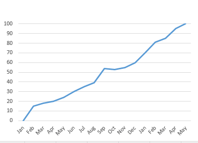
A run chart is a simple graph that tracks data points in a time sequence. It helps identify trends, shifts, or patterns in a process. Unlike control charts, run charts do not include control limits and instead focus on visualizing how a process behaves over time.
Each data point represents a measurement, and the chart shows how the values change to a central line, typically the median. Run charts are useful for detecting non-random variation and shifts in performance, making them a valuable tool for process improvement and quality monitoring in various industries.
A run chart helps you analyze:
- Trends in the process.
- If the process has shifted.
- Whether or not the process has any patterns.
Small to medium-sized organizations use run charts to communicate project progress with clients.
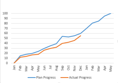
You will need to draw the planned progress line. Once the project starts, you will update this chart with a new line showing the actual progress. This lets the client see status and variation.
Example of Run Chart in Real World Scenario
An example of a run chart can be observed during a live match broadcast if you are a cricket fan. As the commentator presents the score of the first team, you get a clear visual of their performance.
Once the second team starts batting, you can track and compare their progress in real-time. This lets you see how each team’s scores evolve throughout the match, providing valuable insights into their performances.
Benefits of Run Charts
- Easy to Use: Run charts are simple to create and interpret, requiring no complex statistical knowledge.
- Identifies Trends: They help detect trends, shifts, or patterns in data over time, making it easier to spot process improvements or issues.
- Monitors Process Performance: Run charts represent a process’s performance over time, offering real-time insights.
- Quick Insights: Run charts have no control limits and give a quick snapshot of performance without the need for deep analysis.
Limitations of Run Charts
- No Control Limits: Unlike control charts, run charts do not have control limits, making it harder to determine if a process is stable or in control.
- Limited Statistical Analysis: Run charts cannot differentiate between common cause and special cause variations, providing less precise diagnostic capability.
- Basic Data Representation: They offer only a basic overview of data trends and may require additional tools for deeper process analysis.
- Limited Predictive Power: Run charts are good for visualizing trends but cannot predict future outcomes or highlight the cause of variation.
Difference between Control Chart and Run Chart
The following table shows the key difference between the control chart and the run chart:
| Parameter | Control Chart | Run Chart |
| Purpose | Monitors process stability and identifies variations. | Tracks data trends over time without control limits. |
| Control Limits | Includes upper and lower control limits based on statistical calculations. | Lacks control limits, focusing solely on data points. |
| Variations | Distinguishes between common cause and special cause variations. | Does not differentiate between types of variations. |
| Data Analysis | Provides a more detailed analysis of process behavior and performance. | Offers a simpler visualization of data trends. |
| Complexity | Requires knowledge of statistical concepts to interpret effectively. | Easier to understand and create, suitable for basic analysis. |
| Application | Used in quality control and process improvement initiatives. | Useful for identifying trends and shifts in various contexts. |
When to Use Control Charts and When to Use Run Charts
Use control charts to monitor process stability and variability over time. They are ideal for situations where you want to identify and distinguish between common cause and special cause variations. Control charts are particularly beneficial in quality control and manufacturing environments, where maintaining consistent performance is critical.
Run charts are best used for tracking data trends and patterns over time without statistical limits. They are effective when you want a straightforward visual representation of a process’s performance. Run charts are suitable for preliminary data analysis, helping identify shifts or trends before more detailed investigation is required.
Summary
Run charts and control charts are valuable tools in project management. Examining either can reveal insights that reading multiple reports may not provide. While both charts are useful, control charts offer more detailed information than run charts. By effectively utilizing control charts, you can identify and eliminate errors in products and processes, allowing you to focus on continuous improvement.
Further Readings:
- Seven Basic Quality Tools
- What is a Scatter Diagram?
- Fishbone (Cause and Effect or Ishikawa) Diagram
- What is a Pareto Chart?
- Common Cause Variations Vs Special Cause Variations
Reference:
This topic is important from a PMP exam point of view.

I am Mohammad Fahad Usmani, B.E. PMP, PMI-RMP. I have been blogging on project management topics since 2011. To date, thousands of professionals have passed the PMP exam using my resources.


We are running with run chart in our process, but sample size is 2, is it correct or not.
Please help me. On urgent basis.
I did not understand your question Naveen. Can you explain it in more detail?
Hi..usually corrective actions will be taken after defect repair..so that we make sure it wont get repeated…in this case if the point appears out of upper control limit,is it defect?
It is not a defect as it is still between specification limits but you will try to bring it between control limits.
Very nicely explained in a simple language . I was struggling to understand this .
I have one small question. What is the difference between run and a shift in run chart. What I get is that shift is also a type of run.( Run being defined as consecutive points on same side of median). where can I read more blogs from you.?
Thanks
You can read about the shift in run chart by following the given link:
http://www.sixsigmadaily.com/run-chart-shifts/
Other blog posts published on this blog can be find by clicking below given link:
https://pmstudycircle.com/study-notes/
Reaily good explain i search this topic and got useful things
Thanks Sanjay for your visit and leaving comment.
Hi Fahad,
Thank you for the explanation. What happens if the data points fall on specification limit? Can the product be still delivered to customer ?
Regards,
Pruthvi
Usually any data falls outside the line considered as a defect, otherwise not.
Hello,
Don’t you think the above diagram is incorrect? Specification limit should be within Control Limit? Can you please explain?
Specification limits are set by the client that cannot be breached, on the other hand control limits are set by the project manager to keep the process under control.
Nice to see that over the past few years, people have found this continuing post useful.
I would like to note that the LCL and UCL are set by the data that is being analyzed (specifically ¯x±3?) . The person performing the analytics should not set or adjust the control limits. The control chart also does not include specification limits (LSL and USL). These metrics would be included in a process capability analysis. Basically the control chart (also termed as a process behavior chart) is the Voice of Process (VOP) to quantitatively show how the process is functioning. Matched with the capability analysis, you are then able to take the data of process output and demonstrate how that relates to your customer specifications, or Voice of Customer (VOC). Altering the control chart from the original form dilutes the VOP signals you are looking for understanding the process behavior. Another very good resource for understanding control charts is Understanding Variation: The Key to Managing Chaos, by Donald Wheeler.
Hi Fahad,
I am having trouble trying to understand a Control Chart question from Oliver’s free 75 question, wonder if you or anyone could shine some light here.
A production process has been defined as part of an industrial equipment manufacturing project. The process is intended to produce steel bolts with a length of 20 cm. The control limits are 19.955cm and 20.045cm. The measurements made at the end of the process yielded the following results:
20.033cm, 19.982cm, 19,995cm, 20.006cm, 19.970cm, 19.968cm, 19.963cm, 19.958cm, 19.962cm, 19.979cm, 19.959cm.
What should be done?
(a) The process is under control. It should not be adjusted.
(b) A special cause should be investigated, the process should be adjusted.
(c) The control limits should be adjusted.
(d) The measuring equipment should be recalibrated.
I roughly plotted the chart and gathered these thoughts:
– the measurements are all within the control limits
– there are eight measurements closely aligned (Rule of 7) and two measurements away from them
I answered (d) however the answer is (b) special cause. However, you mentioned above that special cause applies when the measurements are out of control limits. Hence, I am confuse on how to answer such question. When we do apply (a), (b), (c) and (d)?
If you notice last seven readings, you will find that they are on one side of the mean. So the rule of seven will apply here.
Good. Useful for simple understanding.
Thanks Nagendra.
Great explanation! Thank you :)
You are welcome Veena.
Thanks again! you made the ‘control chart’ concept very clear to me!
You are welcome Icm.
Good illustrations for Control and Run Charts as well as explanations!!
Thank you Oliver for your comment.
1) Can specifications limit come in the control limit ? Who put control limit Project manager or member of project team or stackholder, customer, end-user etc.
2) Do specifications limit show the sigma value?
All these are defined in the quality management plan, and the planning required consultation with all concerned stakeholders.
Thank a lot. I’m learning Quality in PMBOK5. Your post is useful. :)
You are welcome Luu.
Does seven run rule apply for the quality control sample prepared for longer time (eg one month) and used each day in a routine lab?
The rule of seven clearly says that if seven or more consecutive data points fall on one side of the mean, then you must find the reason for it, it does not matter even if these points fall within the control limits.
So using the same QC sample for a longer time could be one of the reasons for having
seven or more consecutive data points fall on one side of the mean? It is dificult to prepare fresh QC samples every day for a routine lab.
Once you get the sample and you find a cause for investigation, you will investigate and rectify the process. Then you will again take the sample to see if everything is fine.
Hello Fahad:
The exam questions, for example, include mean as 93.9887 and data point as 93.9845 or 93.9888. Should one round up or round down or simply compare. That is, should I assume that 93.9888 is above 93.9887?.
Regards
Akhtar
Usually after decimal, two digits are fine. You can also make it round, depends on the question.
I always like the way you put complex stuffs/methods in most simplest of the way possible! For example, while reading this, I noticed how superbly you gave the example of “cricket score line” to explain “Run Charts”. Keep the good work up!
Examples are always good to relate with the concepts, that is why I always try to include a real world example to make concept easier for visitors.
Dear Fahad
If UCL is 10 and point is at 10 and 11.
So 10 is considered out of control or in control. And for 11 the process is out of control or needs to be investigated for adjustment which one option is correct.
In fact you should specify it your quality management plan. However, if 10 is the UCL then it will not considered as out of control.
If it goes to 11, although it is under control, you need to take the corrective action.
Please note, it must not cross the upper and lower specification limits, in this case, you can say that it is out of control.
For a process to be out of control, it should have a data point outside control limits and not necessarily Specification limits.. therefore, this above example where process point is at 11 it is out of control.
Please correct my understanding if wrong.
It should below the upper specification limit. Specification limits are set by the customer and control limits by the project manager.
So if “11” is above control limit but below specification limit, most likely, it will be acceptable.
Dear Fahad
Nice explanations, Kindly explain about Assignable cause or Special Cause in Control Charts.
I think you are asking about the assignable cause and common cause because assignable cause and special cause are the same thing.
Common causes are normal causes that occur on your process. These are not considered as unusual. In control charts these are shown within the control limits.
Special cause are variance, not expected in the process. These are shown outside the control limits. You can also call them defects.
Thanks Fahad
Which of the following statements is true about control charts ?
a. Special causes are easier to predict and handle than common causes
b. Common causes are easier to predict and handle than Special causes
Can you explain.
I have already explained the common and special cause:
Common causes are normal causes that occur on your process. These are not considered as unusual. In control charts these are shown within the control limits.
Special cause are variance, not expected in the process. These are shown outside the control limits. You can also call them defects.
So as per my understanding common cause are easier to predict and manage. In fact these are not considered as abnormal as these falls within the control limits.
Thank a lot Fahad for great explanation.
You’re welcome Umasankar.
Brother,
My name is Royal I am working as an engineer in Saudi Arabia. I have cleared my PMP exam in my first attempt in Saudi on past 17th of this month. Really Your notes and guidance helped me a lots to my success & i have advised many of friends to take part of your blog during preparation .
Further, i need your suggestion to select coarse between PMI SP or PMI – RMP next to my PMP Bit i confused & i am basically from mechanical engineer, kindly suggest me to select the correct one to enhance my carrier.
Royal – PMP.
Congratulations Royal for passing the exam, and I am glad that my blog helped in your studies.
Regarding the choice, if it is between PMI-RMP and PMI-SP, I suggest you go for the PMI-RMP unless you have any other reasons to select the PMI-SP.
There is another course for scheduling professionals from from AACE (http://www.aacei.org/), which is known as PSP. You can also go for this course.
Thanks Brother, Can you share me your RMP study notes, if you can please send me the details to my following My mail id – [email protected] and also suggest me some good R.E.P for attend 30 PDU classes.
I don’t have anything in soft format to send you through email.
You can refer my lessons learned by clicking below given link. It will answers your rest of the questions.
https://pmstudycircle.com/2012/04/i-passed-my-pmi-rmp-risk-management-professional-exam-lesson-learned/
Hi Fahad,
Thanks for your beautiful explanation about Control Chart and Run Chart. I have one more suggestion. It would be great if you could define the lines meant for UCL and LCL with ‘text’. Even while descriping you can say the red lines are the Mean, Green lines are the UCL and LCL and the blue lines above/ below them is the specification limit.
I would also request you to explain the for Earned value management. I would like to know when you look at te chart marked with AC, EV and PV, how do you come to know exactl, by looking at the chart which is bigger? The PV or EV?
Thanks Vidya for your comment, I have updated these information into the text, picture will be updated soon as well.
Regarding your second request, I will write another blog post.
Hello Vidya,
control chart is updated with texts.